Home Dashboard Reports
Last updated: September 22, 2026
Overview
The Home dashboard is a snapshot of savings, spend, and top vendors across your organization — the default view under Reports → Dashboards. It's built from ten widgets: five headline numbers, two charts that break spend down by category and vendor, one progress indicator, and two ranked lists. Together they answer three questions at a glance: how much has Spendflo won for you, how much you're saving, and where your money is actually going.
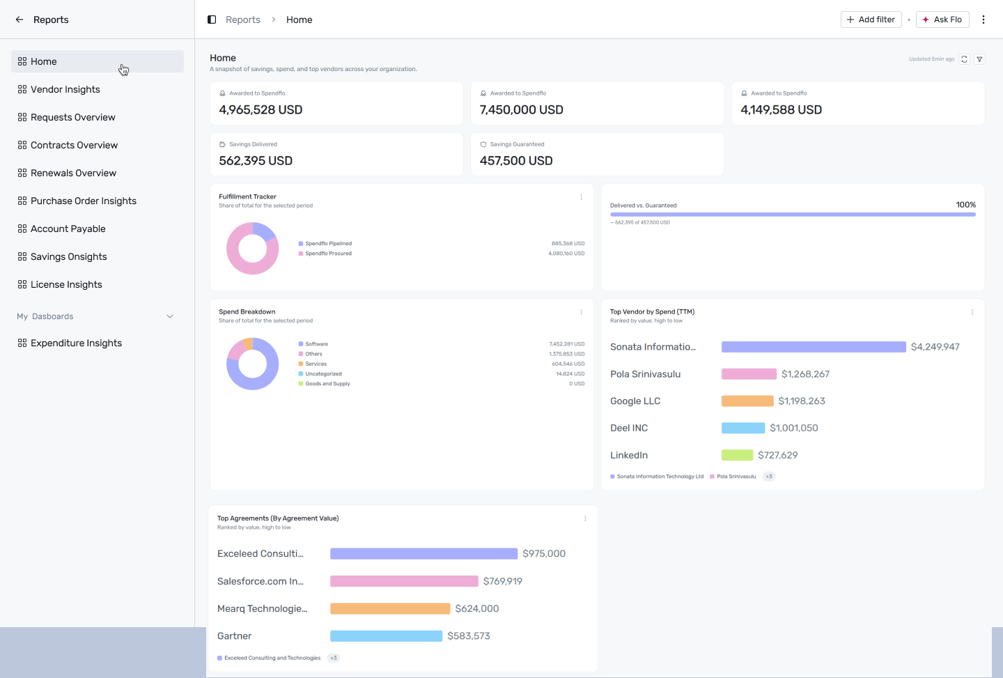
Reports → Dashboards → Home
Filtering
Click + Add filter to narrow this dashboard by:
- Date — narrows the spend-related widgets (Fulfillment Tracker, Spend Breakdown, Top Vendor by Spend, Top Agreements) to a specific window.
- Department — scopes Savings Delivered, Guaranteed vs Savings, Spend Breakdown, and Top Vendor by Spend to a single department, useful when a department wants to see just its own numbers.
A filter only affects the widgets whose underlying report supports that dimension — the rest of the dashboard is left unchanged and marked as not applicable, so you won't misread a number as filtered when it isn't.
Reports on this dashboard
Awarded to Spendflo (Actual)

The total value of deals that have actually closed and been awarded to Spendflo to run, for the selected period — not what's contracted or projected, but what's real today. This is your realized win with Spendflo so far: if it's tracking well below the Contracted or Annualised figures next to it, that gap is deals still in motion, not deals lost. Click View Report to see exactly which contracts make up the total, split by Spendflo Procured vs. Spendflo Pipelined, plus a full record per contract (vendor, products, dates, cost, status, and type).
Awarded to Spendflo (Contracted)

The total value of everything currently under contract and routed through Spendflo — the committed number, regardless of how spend lands month to month. Treat this as your ceiling for the period, and compare it against Actual to gauge how much of what's contracted has actually materialized versus still ahead of you.
Awarded to Spendflo (Annualised)

Takes the contracted value and normalizes it to a 12-month run-rate, so contracts of different lengths and start dates become comparable on the same annual basis. Use this figure when you want a clean year-over-year comparison instead of the Contracted total, which can be skewed by multi-year deals or deals that only cover part of the year.
Savings Delivered

Total realized savings, in USD, that Spendflo has delivered to date for the selected scope. This is money already saved, not projected — it only grows as negotiated savings are confirmed. If Department is applied, this is that team's own contribution to the total.
Savings Guaranteed

The savings amount Spendflo has committed to deliver, in USD, for the same scope. This is the target, not the result — pair it with Savings Delivered (or the Delivered vs. Guaranteed widget below) to see how close you are to the commitment.
Fulfillment Tracker

A donut chart that splits your total fulfillment value into two slices — Spendflo Procured (deals Spendflo has fully run and closed) and Spendflo Pipelined (deals in progress) — each shown as its share of the combined total. A larger Procured slice means more of your pipeline has already converted into closed, managed spend; a large Pipelined slice isn't a problem by itself, but worth checking if it's been sitting flat over time. Click into the Procured slice's View Report for a monthly trend and a full contract-level table; the Pipeline drill-through doesn't currently return data.
Delivered vs. Guaranteed

A progress bar that plots Savings Delivered as a percentage of Savings Guaranteed (delivered ÷ guaranteed). Under 100% means you're still working toward the guarantee; at or above 100% means Spendflo has already delivered everything it committed to for this scope, and the caption updates to call that out and point to additional savings beyond the guarantee. This is the fastest way to check whether you're ahead or behind on savings without doing the math yourself.
Spend Breakdown
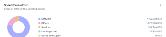
A donut chart that splits total spend across categories — Software, Services, Consultancy, Goods & Supply, Others, and an Uncategorized bucket for anything not yet classified — each slice sized by its share of total spend. Use this to sanity-check where your budget concentration actually sits versus where you assume it sits. A sizeable Uncategorized slice is worth investigating on its own — it usually means spend records that haven't been mapped to a category yet. Click View Report for the underlying contract list (vendor, offerings, category, dates, cost, annualized cost, and type).
Top Vendor by Spend (TTM)
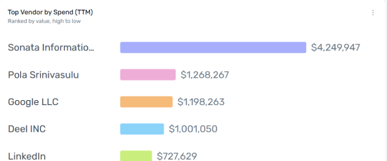
A horizontal bar chart that ranks vendors by trailing-twelve-month spend, highest to lowest. This is your concentration-risk and negotiation-leverage list in one view — the vendors at the top are both your biggest cost centers and your best candidates for renewal negotiation, since spend size usually correlates with negotiating leverage. Click View Report for the complete ranked list beyond the top few shown here.
Top Agreements (By Agreement Value)
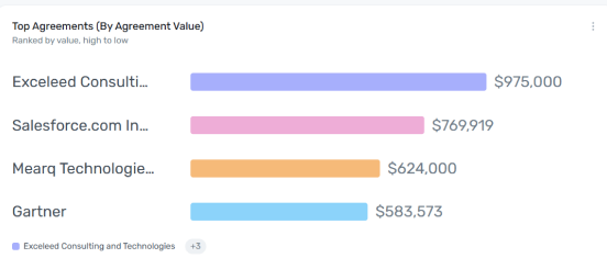
A horizontal bar chart that ranks individual contracts/agreements by total value, highest to lowest — note this is per-agreement, not per-vendor, so a single vendor can appear more than once if they hold multiple contracts. Use it alongside Top Vendor by Spend to spot cases where one very large single contract, rather than broad spend across many deals, is driving a vendor's overall ranking. Click View Report for the full ranked list.