Purchase Order Dashboard Reports
Last updated: September 22, 2026
Overview
The Purchase Order dashboard tracks purchase order value, lifecycle status, coverage, and outstanding commitments. It's under Reports → Dashboards → Purchase Order.
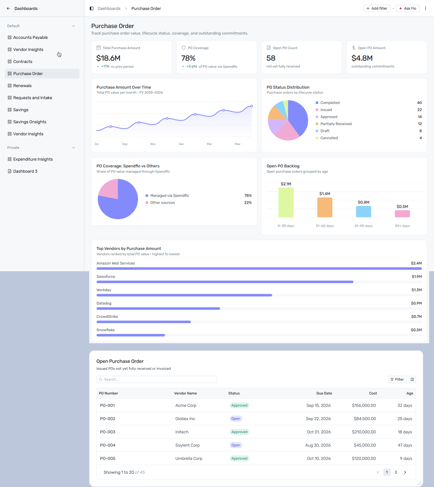
Reports → Dashboards → Purchase Order
Filtering
Click + Add filter to narrow this dashboard by:
Date — applies to Purchase Amount Over Time, Open PO Backlog, and Top Vendors by Purchase Amount.
Department — not currently supported by any report on this dashboard.
A filter only affects the widgets whose report declares that dimension — anything else is left unchanged.
Reports on this dashboard
Total Purchase Amount
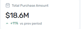
The total value of purchase orders raised, with a trend badge against the prior period. This is your headline PO volume number in dollar terms.
PO Coverage
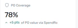
The percentage of PO value routed through Spendflo, with a trend badge. A rising percentage means more of your purchasing is flowing through a managed process rather than happening outside it.
Open PO Count
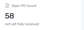
The count of purchase orders that have been issued but aren't yet fully received. Use this alongside Open PO Amount — a high count of low-value POs is a different operational problem than a low count of very large ones.
Open PO Amount
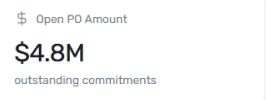
The dollar value still outstanding across all open purchase orders — committed spend that hasn't been fully delivered or invoiced yet. This is your open-commitment exposure at a glance.
Purchase Amount Over Time
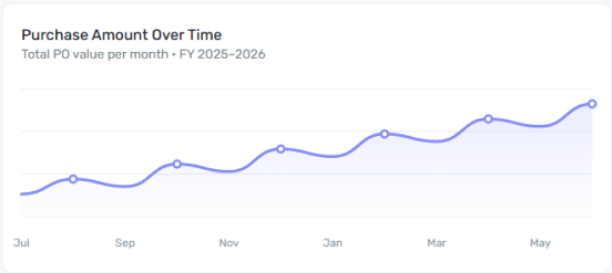
A line chart of total PO value issued each month across the fiscal year. Use the trend direction to see whether purchasing activity is accelerating or slowing, independent of any single month's spike.
PO Status Distribution
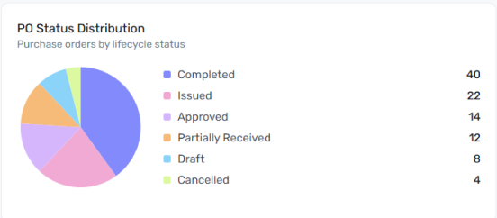
A pie chart of PO counts by lifecycle status — Completed, Issued, Approved, Partially Received, Draft, or Cancelled. This is a count breakdown, not a value breakdown, so it tells you how many POs are stuck at each stage rather than how much money is involved.
PO Coverage: Spendflo vs Others
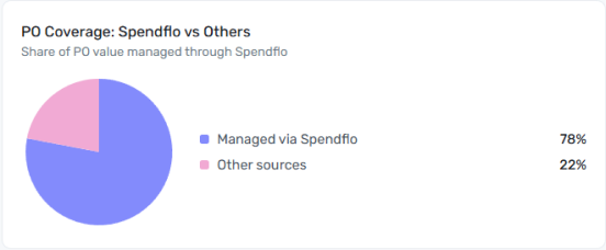
Splits total PO value into what's managed via Spendflo versus other sources. This is the same coverage concept as the PO Coverage KPI above, shown here as a share of the whole rather than a single percentage — useful for seeing the actual dollar split, not just the rate.
Open PO Backlog
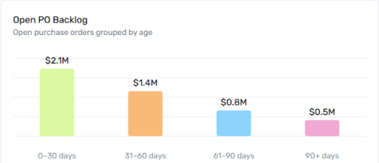
Buckets outstanding PO amount by how long it's been open — 0–30, 31–60, 61–90, or 90+ days. The further right the weight of the bars sits, the more of your open commitments are genuinely aged rather than simply recent, which is a sign fulfillment or invoicing is falling behind.
Top Vendors by Purchase Amount
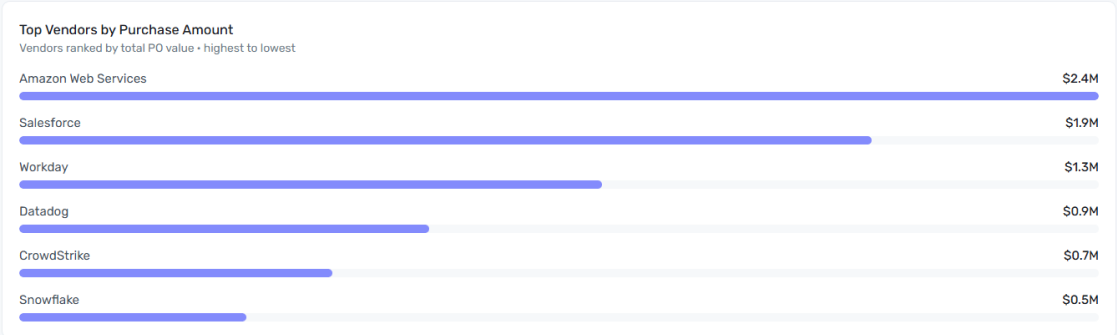
Ranks vendors by total PO value, highest to lowest. These are the vendors driving the bulk of your purchasing activity — useful context alongside the outstanding-amount view on the Accounts Payable dashboard, since a vendor high on both lists represents both significant purchasing volume and payment exposure.
Open Purchase Order
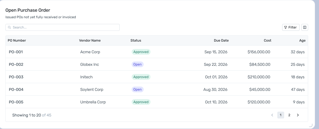
A row-per-PO table of issued purchase orders not yet fully received or invoiced — PO number, vendor, status, due date, cost, and age. Use this once a chart above (Open PO Count, Open PO Amount, or Open PO Backlog) tells you there's a backlog and you need the specific POs behind it; the list is paginated, so search or filter rather than scanning page by page.