Vendor Insights Dashboard Reports
Last updated: September 22, 2026
Overview
The Vendor dashboard (shown as Vendor Insights in the sidebar) tracks vendor spending trends, top vendors, cost distribution, and vendor review activity over the selected period. It's under Reports → Dashboards → Vendor Insights, and combines what used to be two separate dashboards — vendor spend/agreements and vendor risk reviews — into one.
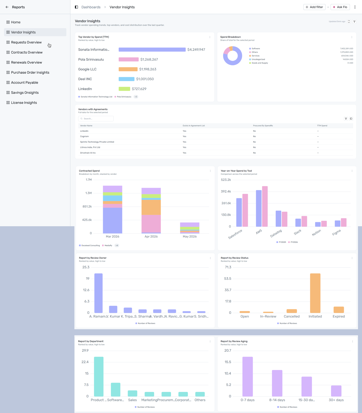
Reports → Dashboards → Vendor Insights
Filtering
Click + Add filter to narrow this dashboard by:
- Date — applies to Top Vendor by Spend, Spend Breakdown, Contracted Spend, Year-on-Year Spend by Tool, and all four vendor-review reports.
- Department — every report on this dashboard supports it, so it's the broadest filter here.
A filter only affects the widgets whose report declares that dimension — anything else is left unchanged.
Reports on this dashboard
Top Vendor by Spend (TTM)
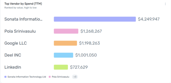
Ranks vendors by trailing-twelve-month spend, highest to lowest. This is your concentration list — the vendors at the top account for the largest share of your spend, which also makes them your best candidates for renewal negotiation.
Spend Breakdown
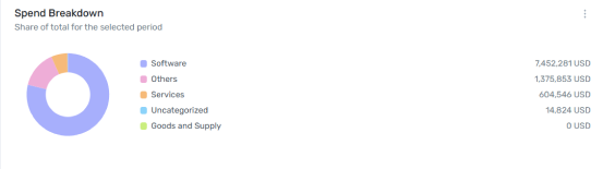
Splits total spend across categories — Software, Services, Consultancy, Goods & Supply, Others, and an Uncategorized bucket — each slice sized by its share of total spend. A sizeable Uncategorized slice usually means spend records that haven't been mapped to a category yet, worth investigating on its own.
Vendors with Agreements

A full, searchable table of every vendor, showing whether each one exists in your agreement list, whether it was procured by Spendflo, and its trailing-twelve-month spend. This is a data-quality and coverage check as much as a spend report: a vendor with real spend but no agreement on file is a compliance gap, and a vendor with an agreement but "Procured by Spendflo: No" is spend that bypassed Spendflo entirely — both are worth chasing down. With hundreds of vendors typically listed, treat this as a searchable reference table rather than something to scan top to bottom.
Contracted Spend
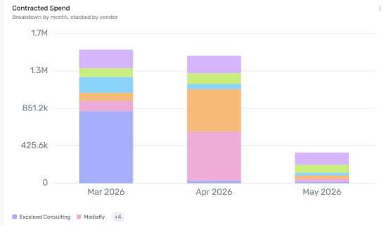
A stacked bar chart of contracted spend by month, with each bar broken into segments by vendor. Watch for a single vendor's segment dominating a month's bar — that's concentration risk sitting inside what otherwise looks like normal monthly spend. A "group by" control lets you re-slice the same chart by a dimension other than vendor.
Year-on-Year Spend by Tool
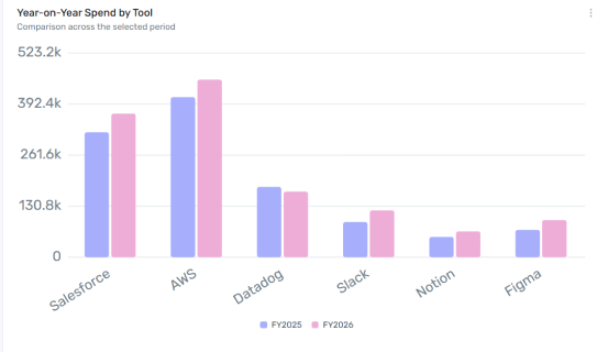
A grouped bar chart comparing each tool's spend in the prior year against the current year, side by side. This holds regardless of who negotiated the renewal, so it's a clean read on whether a tool's cost is trending up or down year over year — useful for spotting creeping renewal increases before they compound further.
Report by Review Owner
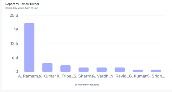
Counts vendor reviews by the person who owns them. A tall bar for one owner means that person is carrying most of the review load — useful for spotting an uneven workload before it becomes a bottleneck.
Report by Review Status
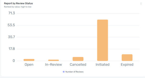
Counts vendor reviews by status — Open, In-Review, Cancelled, Initiated, or Expired. A healthy pipeline moves reviews from Initiated through In-Review to a close; a large Cancelled or Expired count is worth a closer look, since it usually points to a breakdown earlier in the review process rather than the vendors themselves.
Report by Department
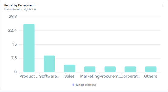
Counts vendor reviews by the department that requested or owns them. Use it to see which teams are generating the most vendor-review work, which is often a proxy for which teams are bringing in the most new vendors.
Report by Review Aging
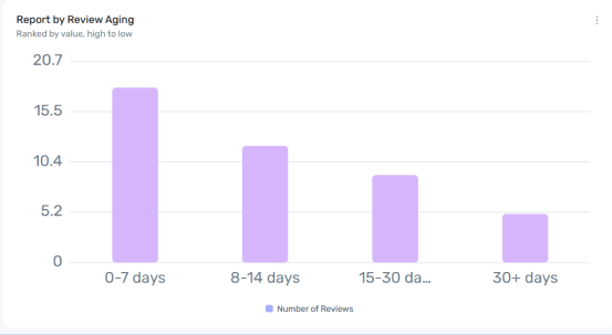
Buckets open vendor reviews by how long they've been open — 0–7, 8–14, 15–30, or 30+ days. This is your backlog check: the further right the weight of the bars sits, the longer reviews are stalling before completion, and a heavy 30+ bucket is a sign the review process needs attention.